If you’re not a designer/art director you might not be aware of this – but the phrase ‘Can you make the logo bigger’ is something of a bugbear for us branding designers.
Why ?
After all there’s a good reason why it’s probably the most common response from clients on first sight of the creative work they’ve invested in. It’s quite understandable – you’re paying for it and it’s representing your business and brand. So of course you want it large… Of course you want it noticed…
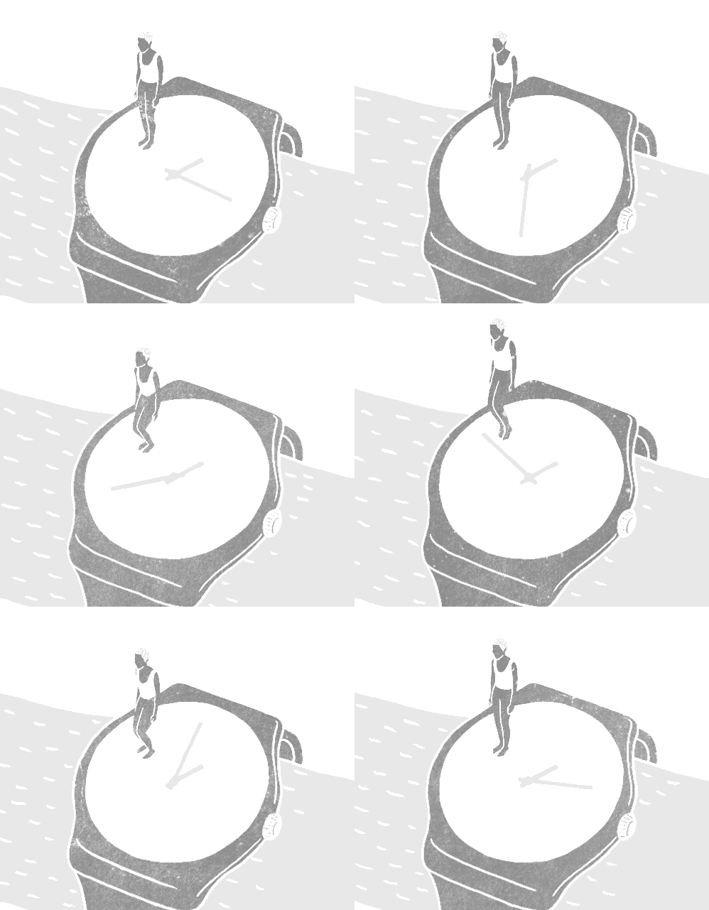
So what’s the problem? Well, for one thing, in branding, as in certain other facets of life we could mention, size really isn’t everything! We creatives put a lot of thought into the creation and development of a brand identity – of which the logo is but one element – in a harmonious ensemble. And a lot of that thought and work goes into determining precisely the size and spacing of elements that best communicates what you want to say.
And if you make one element unnecessarily large, you risk appearing to SHOUT AT YOUR TARGET AUDIENCE. Which isn’t usually considered a good thing.
Your logo is vitally important – of course. But its job is to reflect your overarching brand personality generally and to serve as an identifier to accompany any communication to make sure there’s no doubt who’s ‘talking’.
Quietly confident.
Better by far, we always advise, to convey your message with quiet confidence. It’s important to remember that your logo’s role in the overall branding is to clearly identify you; to symbolise without words what your brand stands for. If take a look at the extensive range of our client logos in our logofolio, you will be able to see they all symbolise the brand.
Your logo is vitally important – of course. But its job is to reflect your overarching brand personality generally and to serve as an identifier to accompany any communication to make sure there’s no doubt who’s ‘talking’.
But you don’t need to take our word for it… It may be a cliché but that’s because the saying, ‘a picture paints a thousand words’ is very true – have a quick look at the way the greatest global brands’ websites make excellent yet sparing use of their logos. There you’ll find the proof.
Nike, IBM, EasyJet, BBC, Apple, BT, BMW
All these are deceptively simple; all exude quiet confidence. And they’re utterly consistent – always. You won’t ever see any of these guys ‘SHOUTING’ because they simply don’t need to.
A responsive future?
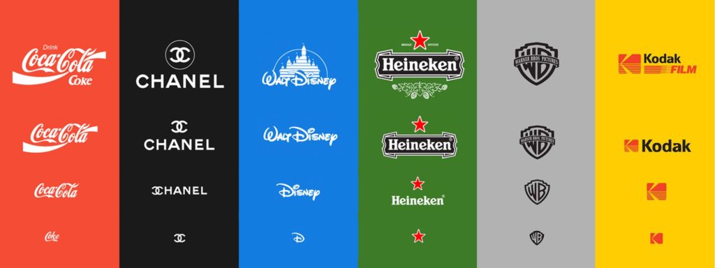
Finally, no discussion of logo use can be complete these days without mentioning Responsive Logos. This is a relatively recent ¬– but in our view really important – development in corporate identity design.

Basically it’s a sensible and pragmatic way of working in a world where your logo and all other design elements are seen on all kinds of media, on screens of many different screens of wildly varying resolutions, sizes and shapes. That calls for a more far flexible and intelligent approach to the use of space than merely scaling things up and down – in practice that means adapting, manipulating or leaving out elements of the logo to make the most elegant and compelling use possible of the screen space available.
So, in summary, our overall answer to the question ‘Can My Logo Be Bigger?’ tends to be…
‘Yes – but it probably shouldn’t be’
With this in mind, if you have any logo quieries of your own, get in touch with our branding experts in hertfordshire who would be happy to help solve any problems.


